My Image Torture Test
- Glenn Randall

- Apr 5, 2018
- 4 min read
Updated: Feb 14, 2021
Watching a person’s eyes as they examine a group of framed prints can be revealing. Their eyes linger on images of interest, and glide right past images they find less appealing. Many factors influence the stopping power of an image, of course, but one attribute shared by strong images that is absent in neglected images is an appealing balance of lights and darks, what Japanese artists call notan. An image that is overall too dark feels “heavy” and is easily ignored.
It can be difficult to determine the best overall density for an image displayed on your monitor. A wide variety of exposures can all look pretty good. An image can seem acceptable on a monitor and still feel too dark when printed.
This problem is particularly acute when editing night images. After all, it was dark out there, and your natural instinct is to create a dark print to capture that nighttime feel. Unfortunately, a print that is literally as dark as what you saw, particularly before your eyes became dark-adapted, is likely to fail as an aesthetic object. Make the print too light, however, and it can look like a daylight image with lots of white dots in the sky. Striking the right balance can be hard. The most common mistake is making the print too dark.
You could just make a series of test prints, of course, but that wastes time, money, and materials. There’s a better solution.

First, set the background of your editing space to white. In Lightroom Classic, in the Library module, display an image in Loupe view (press the spacebar or click the Loupe view icon in the Toolbar), then right-click on the pasteboard outside the image area and choose white. Or open Preferences, select the Interface tab, and choose white as the Fill Color for the Main Window. Now, at the top of the Navigator panel (top-left of your screen), open the drop-down menu and choose 1:16, as shown in figure 1. That will display the image as a thumbnail on a glaring white background. Examine the thumbnail carefully. Can you still “read” the image? Can you still pick out details in the shadows, or do they seem to have merged together into one inky-dark mass?
If the image feels too dark, open it in the Develop module (still viewing it at 1:16) and use the Exposure slider in the Basic panel to lighten the image. Often a change of 0.3 to 0.5 stops is all that is required.
This image torture test relies on an optical illusion called simultaneous contrast. If you place a particular tone, let’s say a middle gray, against a dark background, it will look lighter. If you place the same tone against a white background, it will look darker.
Don’t believe me? Take a look at figure 2. The thin vertical rectangle is an absolutely uniform shade of gray from top to bottom, yet it looks like it contains a gradient from dark at the top to light on the bottom because the background contains a real (but inverted) gradient from light at the top to dark on the bottom. Now look at figure 3, which shows the same thin rectangle set against a pure white background. No gradient is apparent.

Figure 2: The simultaneous contrast illusion. The thin vertical rectangle is a completely uniform tone from top to bottom, but it looks like it contains a gradient because it is set against a background that contains an actual gradient.

Figure 3: The thin vertical rectangle is the same rectangle shown in figure 2. The apparent gradient seen in figure 2 is absent because the background is now a uniform white.
Figures 4 and 5 show two versions of the same image. Figure 5 is a half-stop darker than figure 4. When viewed as images measuring 900 pixels on the long dimension, they both look pretty good. Now examine figures 6 and 7, which show the same images 300 pixels wide, set against a pure white field. Now the darker image, at least to my eyes, simply looks too dark.
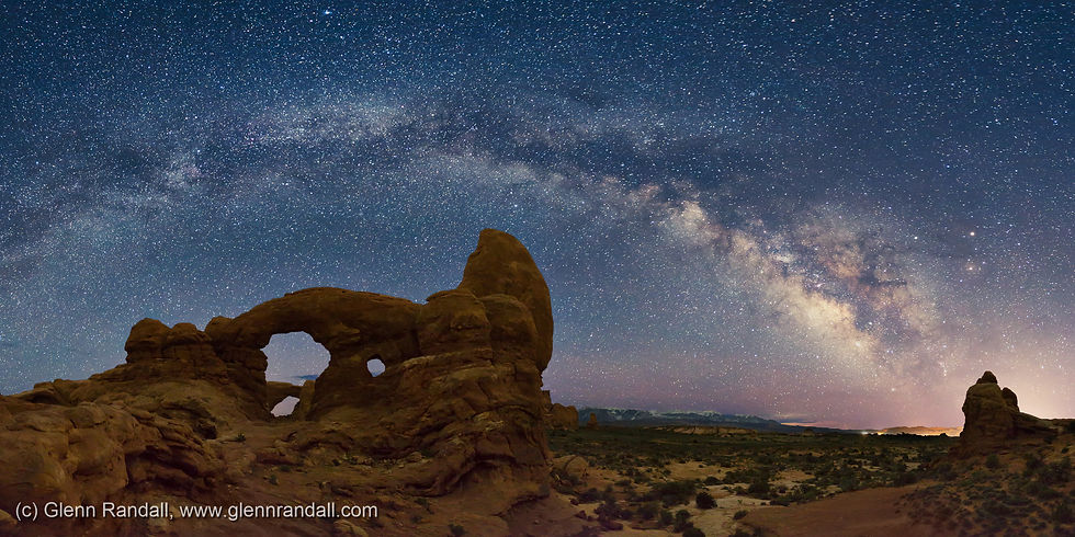
Figure 4: Milky Way panorama over Turret Arch and South Window, Arches National Park, Utah. This image is 0.5 stops lighter than the image in figure 5.

Figure 5: Milky Way panorama over Turret Arch and South Window, Arches National Park, Utah. This image is 0.5 stops darker than the image in figure 4.

Figure 6: This is the thumbnail version of figure 4, set against a pure white background. To my eyes, it still "reads."

Figure 7: This is the thumbnail version of figure 5, set against a pure white background. To my eyes, it has become too "heavy."
Once you’ve adjusted the image until the thumbnail version looks right, make a test print. As a final check, examine the print under different intensities of light at various places in your home. If it only looks good under a track light, it’s still too dark. Most likely you’ll find that if the image looks good as a thumbnail on a white background, it will look spectacular as a print.
Want to know when new blog posts are released? Please join my mailing list!
Want to learn more? Get information on the private and group landscape photography workshops I teach.


Super helpful guide your recommendations are clear and practical. I also saw a https://www.trentonjonesmd.com/procedures/breast-augmentation-and-enhancement/ related resource roundup on a review blog with tips I appreciated too.
This was such a unique and intriguing experiment! Your breakdown of the process made it easy to understand and follow along. I recently read about similar testing approaches on a Texas-based blog https://grandoaksorthodontics.com/, which offered some additional insights that I found quite interesting.
This was a very useful resource for photographers. Weather forecasting can make a huge difference in planning a shoot, and the https://galimidilaw.com explanation here is clear and practical. I recently saw a similar photography resource mentioned on a review blog.
The most reliable indicator of print quality is how the image looks as a small thumbnail on a white background; if it appears balanced and clear at that size, Pokepath TD it will almost certainly translate into an excellent final print.
Editing night images is a delicate balancing act. When you were there, it was genuinely dark, so it feels natural to medical weight loss naples fl want your final print to reflect that mood.